I came across the reMarkable a few months ago, after seeing a video of it used –magnificently– by Pinot Ichwandardi on either his Twitter or Instagram stream (you really should follow both).
For those of you not nerdy enough or who actually had a social life for the last couple of years, the reMarkable is an 11-ish inch tablet running on Linux with an epaper display and stylus. Its only function is note taking and sketching. It doesn’t do (intentionally) much more.
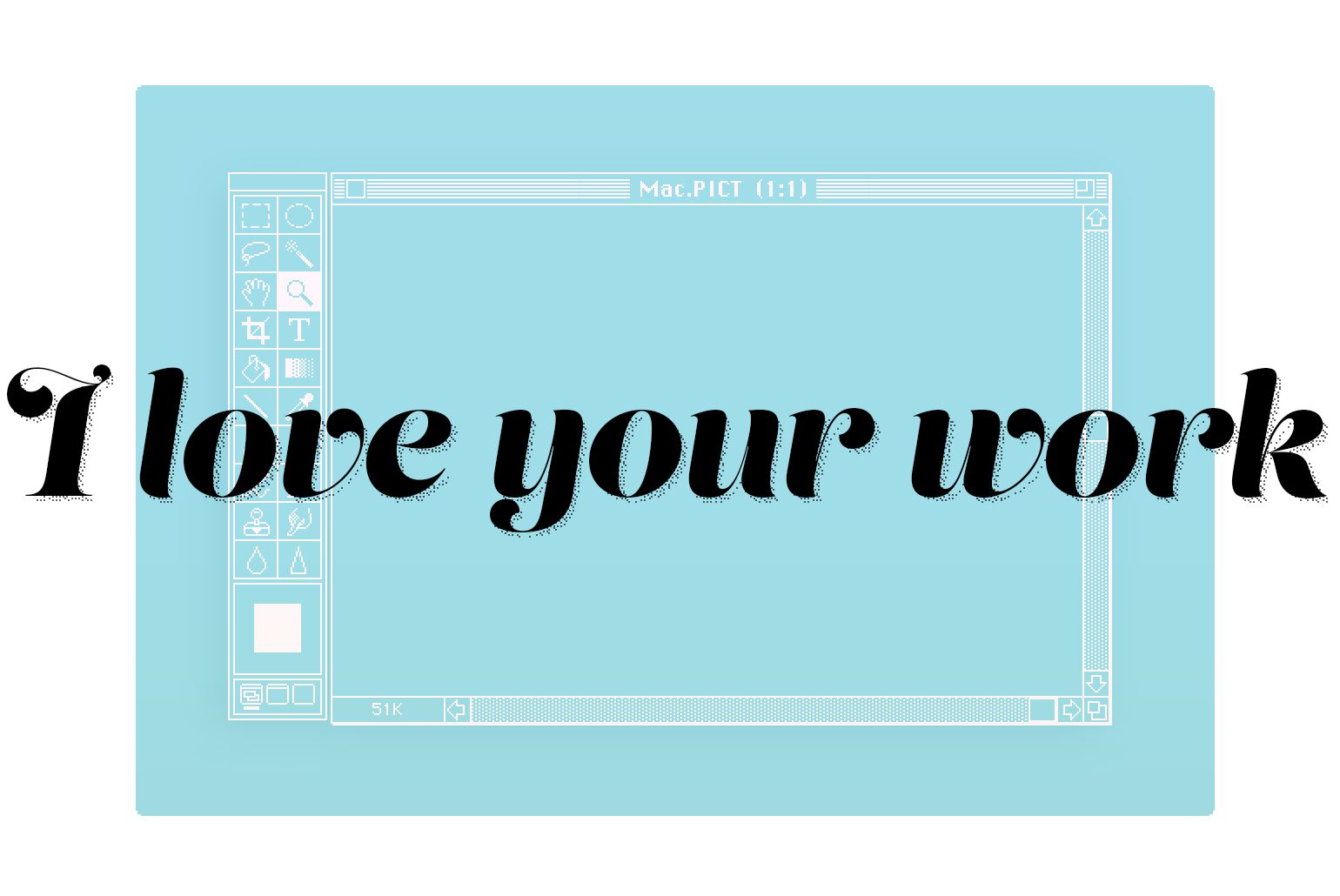
“Introducing” might be a wee bit pretentious. Just a bit. I Love Your Work is going to be a monthly collection of links to (mostly) design and photography work that I admire. The kind of beautiful stuff that makes you feel both completely worthless and inspires you to do better next time.
While on the theme of creativity (risky word), in today’s era of mostly corporate-anaesthetized content, art, and censored nipples, it is worth to sit back and relive the amazingly chaotic creative process of the legendary National Lampoon magazine via Dough Kenney’s life story and the stories about the making of Animal House.
In the last couple of years I started being more and more obsessed by e‑paper displays. I partly blame my Kindle – by far my favourite and the best electronic device I own to date – and my love for 1‑bit graphics.
My first computer was a Macintosh SE and most of my early years in front of a monitor were spent experimenting with Hypercard: you tend to develop a certain (life-long) taste for black and white graphics.
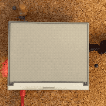
Before summer I bought an Inky pHAT display and put it to use with a spare Raspberry Pi Zero W I had in a drawer in the office, and my old Playstation Eye camera.
The Playstation Eye works “out of the box” with the Pi: taking pictures with it is pretty straightforward. The next logical step for me was to display them as beautiful dithered black and white images on the small e‑paper display.